Introduction:
In last weeks lab we systematically surveyed a sandbox in which we created terrain features just east of the Phillips building on the UWEC campus finding elevation (z) data for each point in a 20 by 20 (400 point) grid created by taught string and tacks. Considering the level of the top of the wooden sides of the sandbox as our zero, points below were considered negative and points above were considered positive. The measurement of such a point is displayed in
Figure 1. Once these points were recorded on paper in the field, they were entered into a Microsoft Excel spreadsheet that included an OID labeled column for importing the data into ArcMap later and also x, y, and z value columns. A sample of these columns is shown in
Figure 2. In that coordinates of these data points are recorded in the sheet in a standardized and ordered way this data is
normalized. The specific method of organization that was used also allowed the data to be used readily in ArcMap.
 |
| Figure 1 |
 |
| Figure 2 |
In this lab, five different methods (algorithms) of interpolation were used to visualize the data collected in the last lab in both ArcMap and ArcScene. Geospatially, interpolation is a process whereby an algorithm uses points to create a "best fit" surface that also estimates the elevations between the points. This results in either raster data as with the spline and kriging techniques, or vector data as with the triangular irregular network technique (TIN). We performed inverse distance weighted (IDW), kriging, natural neighbor, TIN, and spline interpolations.
Methods:
First, an descriptively named folder with a descriptively named file geodatabase inside was created in ArcCatalog. Next, with a right click on the geodatabase, the excel sheet was imported (import > table (single). From here the table was brought into a map file in ArcMap and it was displayed as XY data by right clicking on it in the table of contents and clicking Display XY Data. In the resulting window the appropriate column in the table was chosen for Z data. This data was now ready to be used by the interpolation tools.
The first method performed was inverse distance weighted (IDW) interpolation. This method takes the nearest sampled point to an unknown one and weighs this more heavily than others in its decision making. The radius of which this method searches around each point to guess can be changed to speed up the process in situations where there is a more dense array of points sampled. Due to the fact that this method collects averages, the method will never create a point higher or lower than the maximum and minimum. This method could be used in a situation where points sampled are dense but in our application the method produced a weird circular pattern around points that does not accurately model the area sampled.
A second method performed was the natural neighbors interpolation. This method is local in that it only uses near sampled points, and also does not find trends and predict the outcome of them so it will not depict peaks, pits, ridges, or valleys that are not already shown through the sampled data. This method weights the influence of surrounding points based on the overlap of a new Voronoi (Thiessen) polygon with the already existing neighboring polygons generated. This method should cannot be used if there are more than 15 million input points. This method showed the area surveyed fairly accurately, just as the kriging method did.
A third method is the kriging method. This method also fairly accurately shows the survey area. It is a fairly involved computation heavy (longer) process that uses exploratory statistical analysis, variogram modeling, and more. It fits a mathematical equation to the points in a certain area or radius and uses this to predict points not sampled. Its equation is shown in Figure 3. This process can be long, but it also can very accurately show data, exemplified in it's use in this survey visualization.
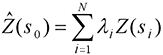 |
Figure 3
http://desktop.arcgis.com/en/arcmap/10.3/tools/3d-analyst-toolbox/how-kriging-works.htm |
A fourth method is spline interpolation. This method most exactly depicted the area surveyed with its wider pits and peaks shown. This method uses a mathematical function that passes through all points collected and minimizes the surface curvature (seemly a good trait for sand that easily erodes and does not like to stay at sharp angles). This method uses a set number of surrounding points and is said to be good by ESRI for slowly sloping changes such as water table, elevation, and pollution levels. This method would be bad for quick changing terrain such as cliffs if not surveyed in high point concentration or other rapidly changing areas.
A fifth and last method used is the triangular irregular network technique (TIN). This method triangulates areas and creates planes that form three dimensional space. This method contrasts the rest because it doesn't create a raster image instead creating vector data. This method creates a sharp instead of smooth image. It also can create irregular false flat surfaces on some slopes, not representing the area surveyed properly. It does, however, represent data captured in irregularily spaced points more accurately such as if one was surveying for vector data walking along the line of a ridge, a river, or other areas capturing points of extremes.
After using these defferent techniques to interpolate the data, in order to standardize the viewing of the data I changed the spline interpolation symbology to classes (9) which all the other resulting files of the interpolations were set to. Bringing these all into an ArcScene file I was able to visualize them in three dimensions. I again changed the symbology to a standardized setting, and also made sure to change the base height in the properties of each model to "floating on a custom surface" that surface being the file itself. With each of these models I selected edit, then copy scene to clipboard, finally pasting the scene into an ArcMap made map with the 90 degree birds eye view map made in ArcMap displayed directly above it. I also inserted a scale bar in an illustration program, and a north arrow, title, and name in ArcMap using the appropriate selections under insert. Cardinal directions are obvious in the three dimensional view because they this graphic is approximately lined up with the map above it which has a clear north arrow. The approximate view (although slightly changed) throughout all of the three dimensional views adequately shows most of the terrain with little obscured by areas of higher elevation.
Results:
First pictured in
Figure 4 is the IDW interpolation. This image did not accurately represent our data. We would have needed more dense data collection for this method to work.
 |
| Figure 4 |
Second pictured in
Figure 5 is the kriging intepolation. This method fairly accurately portrayed our study area. It looks much smoother than the IDW interpolation and accuratley shows peak areas and dip areas.
 |
| Figure 5 |
Third pictured in Figure 6 is the natural neighbors interpolation. This method also fairly accurately displayed our survey area. It makes up for weird circular edges to contours with smoothness in other places. Dips, ridges, valleys, and peaks are accurately shown.
 |
| Figure 6 |
Fourth picture in
Figure 7 is the spline interpolation. This method seemed to most accurately represent the study area, especially the dips and peaks with their general shapes and smoother nature of elevation transition despite the lower resolution appearance.
 |
| Figure 7 |
Lastly, the TIN interpolation is pictured. This model showed sharp angles and did not look as good. This model would be better with data collected differently for the vector nature of the method.
 |
| Figure 8 |
Conclusion:
This method in surveying seems to replicate accurately a larger scale survey thereby giving the class the ability to practice survey and interpolation skills, but does have a few key differences from that larger scale operation. In a larger scale operation a UAS or other crew of people would be working on this project and would be marking points not on an XY grid most likely but with (hopefully) survey grade GPS. The data collected would then not be data without geographic reference and care would have to be placed in displaying the data in correct projection or GCS and creating metadata. This small scale practice however had us think through thoroughly how to survey for a specific purpose (which our group did adequately), reviewing the options in surveying and executing the manner chosen, standardize our data for use in GIS, and run tools, effectively symbolize, change settings, and create cartographically pleasing maps in ArcMap and ArcScene, navigating figures between them, this all being pertinent work to a larger scale operation. This small scale process also is good work to have done because larger scale work may have taken much more processing time and money if mistakes were made. In having to think through this entire process step by step, a larger scale process would come much easier.
Sources:
http://support.esri.com/other-resources/gis-dictionary/search/
http://desktop.arcgis.com/en/arcmap/10.3/tools/3d-analyst-toolbox/how-kriging-works.htm
http://desktop.arcgis.com/en/arcmap/10.3/tools/3d-analyst-toolbox/how-spline-works.htm
http://desktop.arcgis.com/en/arcmap/10.3/tools/3d-analyst-toolbox/how-idw-works.htm
http://desktop.arcgis.com/en/arcmap/10.3/tools/3d-analyst-toolbox/how-kriging-works.htm
http://desktop.arcgis.com/en/arcmap/10.3/tools/spatial-analyst-toolbox/how-natural-neighbor-works.htm
http://serc.carleton.edu/vignettes/collection/42681.html


